July 28th, 2016 by Adam Sandman
customer support user interface
What's in a Theme
We've picked just over a dozen individual options that you can configure to create the theme you want. You can adjust the colors of texts and links,background and alerts, borders, and fonts.
Whatever options you choose, the layout of the application, the overall user interface design remains the same (modern and clean). We want editing themes to be a quick and easy experience. The more options, the more tailored your theme can be. But the more complex, confusing, and convoluted it becomes for you to make any changes.
You pick the dozen or so options you want (or use one of the beautiful themes Kronodesk 2 will ship with) and get on with your day.
Instant Feedback
Many web-based theming tools have options like color pickers laid out in a nice row. As a user though, it can be hard to tell what parts of the site are "headings" vs "widgets"?
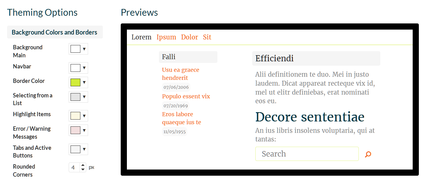
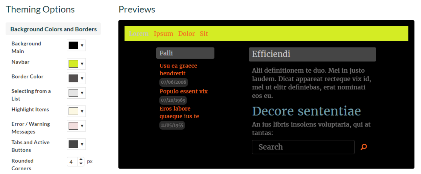
Kronodesk 2 goes further than just having a list of options. Kronodesk's theme options are next to mockup diagrams of the actual application. Any changes you make are instantly reflected in the diagrams.

Want to see what having a yellow navigation bar with a dark page would look like? It won't take more than a few clicks. 
It can still be a bit hard to work out what a color applies to just by the name. Sure, you can change the color to see, but you can also hover the mouse over the name and the relevant parts of the diagram will be highlighted.

Beautiful Fonts out of the Box
Kronodesk comes with a collection of amazing fonts. We've handpicked an array of typefaces that will work well across the application. We think they will be a great and easy way to make your support pages stand out.
Again, if you want to see what a font will look like, select it from the list and immediately see the diagram examples in full fonty goodness.
Instant Changes
Once you are happy with your theme, you can apply it to your site instantly. No file uploads, no waiting. The next time you or a customer visits any part of the application, the new theme will be there.
If you want to tweak an existing theme you can do that too. It shouldn't take more than a handful of clicks.
Branding
In addition to the colors and styles, there are a number of other ways you will want to customize Kronodesk. You can add a company banner image, and custom URLs to point users to the right parts of your site.
What Comes Next?
Kronodesk 2.0 will ship with two or three example themes. You can use those as they are or edit them to your liking. We will definitely include one light theme (white background with light grey accents and dark text) and one dark theme (near black background with light text). If there are other color templates you think should ship as standard options, please comment below.