January 25th, 2016 by Adam Sandman
user experience roadmap test management
Thank you so much
Last week we published mockups for a revised test execution page in SpiraTest. We asked for your feedback and got lots of insightful and useful suggestions. Thank you to everyone who was able to take the time to assist us. The feedback sparked lots of discussion and creative ideas in the team, who have worked really hard to enhance the designs, taking account of as much of the feedback as possible.
If you have further thoughts on the revised designs below, please let us know.
Keep the best from SpiraTest 4
A major theme in the responses was to make sure we don’t lose the best parts of how test execution works in SpiraTest. The two main features we heard from you were:
- the ability to see as much detail about a test step as possible on a single screen (including of embedded images)
- being able to get work done with as little movement or clicking as possible–for example using button groups instead of dropdowns for the test status, and having a clear, easy workflow for adding incidents and screenshots
Adopt new ideas for SpiraTest 5
Feedback was supportive of much of the redesign. Different elements and views appealed to different users, but there were a few common themes:
- having a range of views for different users or type of testing is really valuable
- there will be lots of benefits from having a clean, touch-friendly mobile experience
- the new progress bar will be really useful, with scope to have even more usefulness baked in
- it makes a lot of sense to have text boxes that grow or shrink based on what’s in them to user space better
Changes in the revised mockups
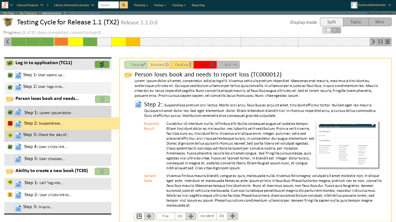
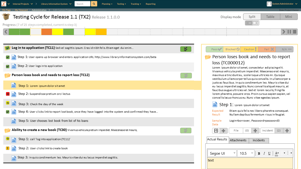
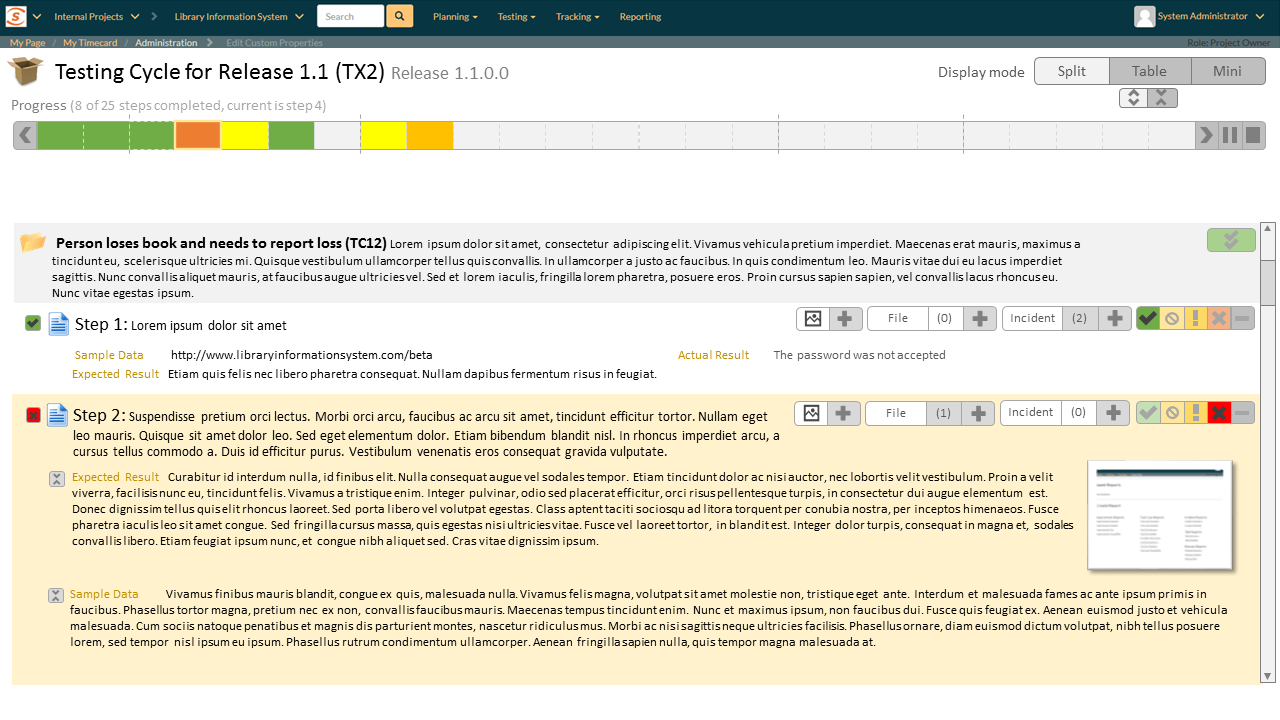
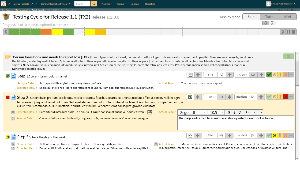
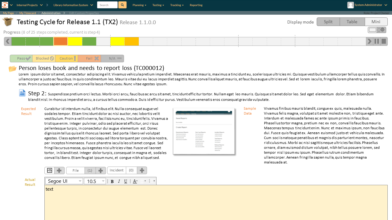
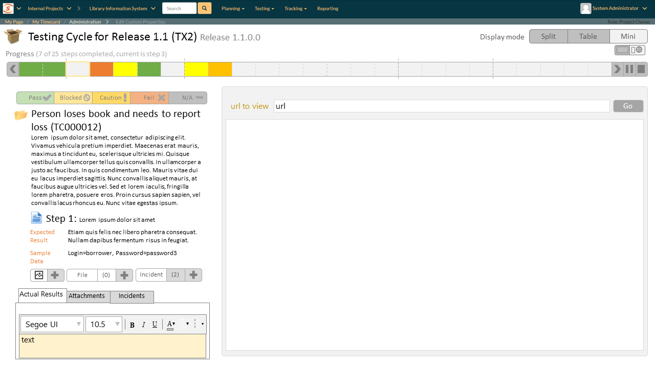
Below you can see new mockups for the test execution page’s revised layouts. What are the differences from our earlier designs?
- separate buttons for recording the test status, instead of a dropdown
- the inclusion of the ‘pass all’ button for a test case
- clear indicators of the recorded test status on the table list
- an expanded progress bar that shows a timeline of each element of a test run. The progress bar also includes forward/back navigation (as another way to move between steps), and embeds the pause and finish/stop buttons
- a dedicated ‘Add Screenshot’ button
- Improved visibility of images embedded in ‘Expected Results’
- each of the three display modes now has two view options: one lets a user see the maximum amount of detail about a test step; the other gives more of an overview (or includes other information on the page)
The split view mode
The first view option in this mode looks very similar to SpiraTest 4.2–a narrow table on the left and a wide inspector with full details on the right.
The alternate view widens the table and narrows the inspector. This view could be useful where test step details are shorter, and to get an overview of all of the test steps in a run.
The table view mode
A table view can be a fast and efficient way to work. But it feels very different when the fields are all brief, compared to when they are very expansive. We intend to add expand/collapse buttons to each field to help a user tailor the table to their needs. The two view options here are shortcuts for expanding all the fields and collapsing them all.
The ‘mini’ view mode
The first view option resembles our current mobile test execution experience: the inspector is full width, and there is no table view at all. A user only sees the current step (and can use the progress bar to navigate between steps as needed). We expect a view similar to this, to be used on mobile devices.
The second view shows the optional iframe for testing a website directly inside SpiraTest. Of course, given that SpiraTest 5 will be fully responsive, if you are testing in a different browser or window, simply resizing your SpiraTest window will allow you to keep both it, and your testing application visible at once.
Over to You
We hope you see even more to like in our further revisions to test execution. As we said above, we would love to hear your further thoughts. In particular, which one or two of the views do you think you and colleagues would be most likely to use?
