January 14th, 2016 by Adam Sandman
user experience roadmap test management
Our designers have come up with a set of prototypes for the test execution page in the next version of SpiraTest 5 to address feedback and usability issues we have identified over the past 5 years. We need your feedback to make sure we're on the right track...
The Heart of SpiraTest
At Inflectra, we pride ourselves on helping teams manage and test their products in a quick, organized, and flexible way. We believe SpiraTest is best in class for helping you manage your tests–the test cases, test steps, test sets, the running of tests, and recording the results.
There are many opinions about how best this last step of this process–test execution–should work. Some testers need to spend substantial on each step. Other testers want a streamlined way of working through tests quickly. And yet others need to be able to run tests and record results on the same screen (or using a secondary device like a tablet).
We need your help
Our designers have come up with a set of prototypes for the test execution page in SpiraTest / SpiraTeam 5 to address these diverse needs. You can see these early mockups below. Please read the team’s explanation, look over the designs and give us your feedback. These designs are not set in stone–we really want to hear from you before the developers start rebuilding test execution from the ground up. With your help, this part of SpiraTest can make your work easier and faster than ever before.
New Test Execution Design Ideas
The designers’ brief had a few important principles that we wanted for the new page:
- provide a number of flexible and intuitive ways to execute tests, allowing users to switch between them easily and quickly.
- give users more context about where they are in the test run.
- use screen space more efficiently and dynamically
- give users more options for working faster.
- hide elements users access less often to give greater focus to what they need to do.
They created a single page with three different views…
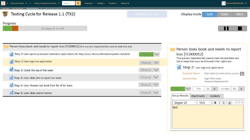
Test Execution Mockup 1: The Split View

Key Features
- An expanded table on the left, with information about each test case and step
- Buttons to set the status on multiple test steps at once
- A progress bar of how many steps are left in the run and how many have passed/failed
- A dynamic ‘inspector’ which shows the details about the currently selected step from the table. This shows all the information as in SpiraTeam 4.2, but in a more condensed form.
- Attachments and incidents are placed inside tabs to save space
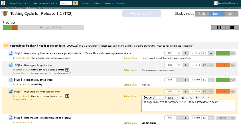
Test Execution Mockup 2: The Table View

Key Features
- A fully expanded table that contains all relevant information about each test step
- The table is the only place to add results or record the test status
- Incidents and attachments can still be viewed–as popups
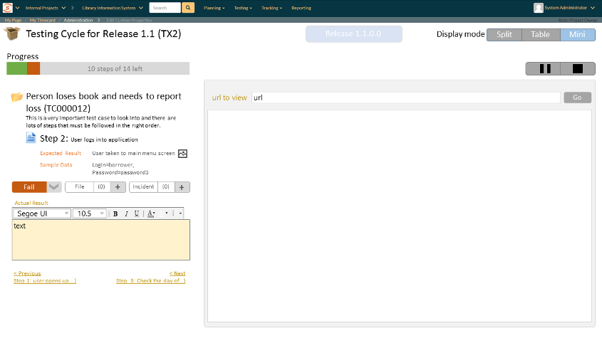
Test Execution Mockup 1: The Mini View

Key Features
- A slightly streamlined ‘inspector’ occupies only a small part of the screen
- Below this there is space to add a narrow table of test steps
- Most of the screen is blank, allowing users to either put another window over it, or use the built in iframe to test web pages directly
- A very similar view to this could be the primary view on mobile devices
Over to You
We hope you can see the potential of these new designs. What do you think? Contact us with your ideas (the above questions are there to get the ball rolling) as soon as you can–this is one of the last pieces of the puzzle before we can complete SpiraTest 5.
Send us whatever comments you like. Here are a couple of questions to get the ball rolling. Will the ‘table only’ view give a more efficient way to get work done? Should we add a dedicated ‘add screenshot’ button to make it easier to add these directly as actual results?
