November 30th, 2015 by Adam Sandman
automated testing user interface
In accordance with the theme this month of user interface updates and user experience in general, we'd like to talk about some of the UI changes being made to our Rapise test automation product. These changes are based on the results of user testing and feedback from our customers. It's an interesting topic because it shows the dramatic impact the UI can have on an application.
Background
As you may know, we're refreshing the user interface of SpiraTeam and KronoDesk in their next releases to be more modern, lightweight and easier to use. They are web applications and there are many tools at our disposal that weren't available in 2011 when their current UIs were developed - Bootstrap, KnockoutJS, jQuery to name just a few!
However when we started looking at the two embedded web pages in Rapise - the Start Page (designed to help new users get oriented) and the Spira Dashboard (designed to help you manage your test cases in Spira from the convenience of Rapise) we realized that they were also not as well designed as they could be and that it made sense to apply the ideas from SpiraTeam. In this case we were constrained to keeping the functionality as-is and to continue to use the older YUI web framework that was already in place.
The Start Page
The current Start Page was designed to mimic the colors and layout of the underlying Windows application, however we found that the overall impression was of a bunch of grey boxes with the headings that were hard to read and text that was too small to understand. Most users skipped over this page and starting using the ribbon at the top. This completely destroyed the purpose of this page, which was to make it easier for new users to get started!!
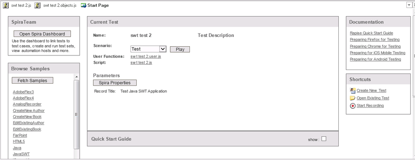
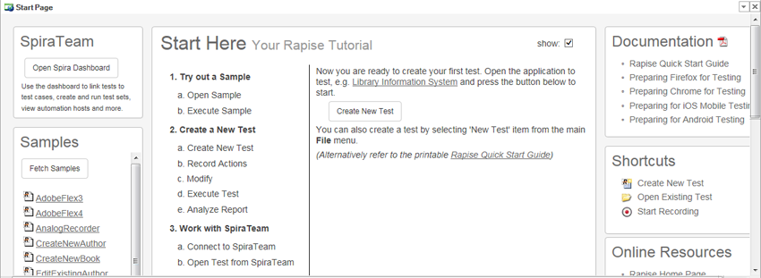
With the new Start Page, the same elements are in place, but we moved the guide for new users right to the top, rather than having it buried under the current test information. Once they choose to hide this guide, the order then reverts. We also removed many of the borders on the page and avoided having grey on grey headings to make everything more legible.
We use also mimicked the Bootstrap styling to make the page look more modern and also to be familiar to users of our website or SpiraTeam 5.0. Finally, increasing the body font size by several orders, make the content come alive instead of being buried under the UI chrome. The finished product looks like:
The Spira Dashboard
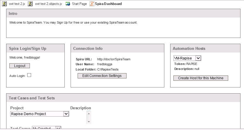
The Spira Dashboard was designed to make it easy for users working primarily in Rapise to be able to see their test cases and test sets in SpiraTest / SpiraTeam and be able to open, save and execute tests directly from within Rapise. This important idea was unfortunately lost to many users because it was not clear what this page was for and the positioning of the elements meant that the most important information (the test case / test sets) were displayed below the fold:
If you scroll down, you might see what you're looking for:
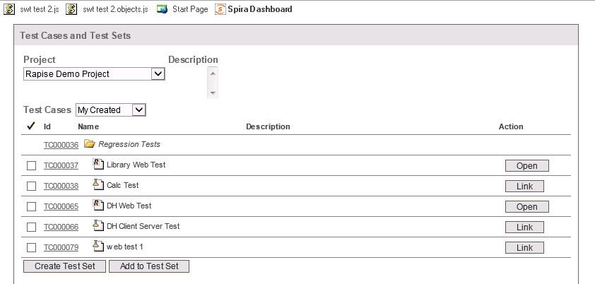
In addition, many of the same issues with the Start Page were also present, weak use of contrast and color meant that it was hard to see the information and the large numbers of similar looking buttons made it difficult for a user to see what were their primary actions.
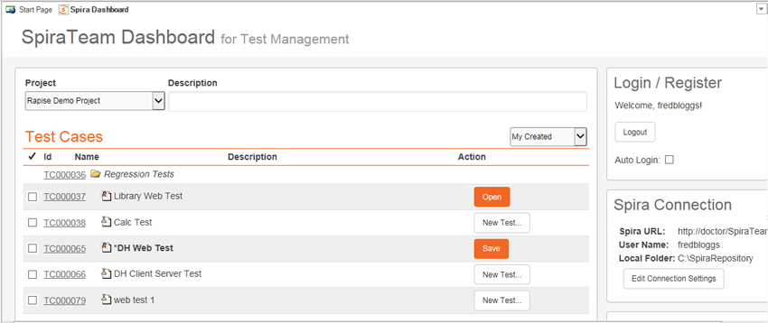
In the modified version, we have simplified the SpiraTeam header and moved the less important widgets to the right-hand side. We also have added (+) prefixes to some of the buttons to make it immediately clear that they add something and we have differentiated between the primary buttons (which are in orange) and the secondary actions which are in white. To make them easier to scan, the grids now have lighter borders and striped rows as well as orange headers that more clearly mark out the test cases from the test sets:
Conclusion
As you can see, by making fairly modest changes, you can dramatically improve the usability of an existing application without having to completely re-engineer it.