January 29th, 2016 by Simon Bor
user experience roadmap test management
We've shared two sets of mockups for revisions to test execution. This has generated great ideas from many of our customers. We want to share a concept from a customer on how one of the views for test execution could look in SpiraTest 5.
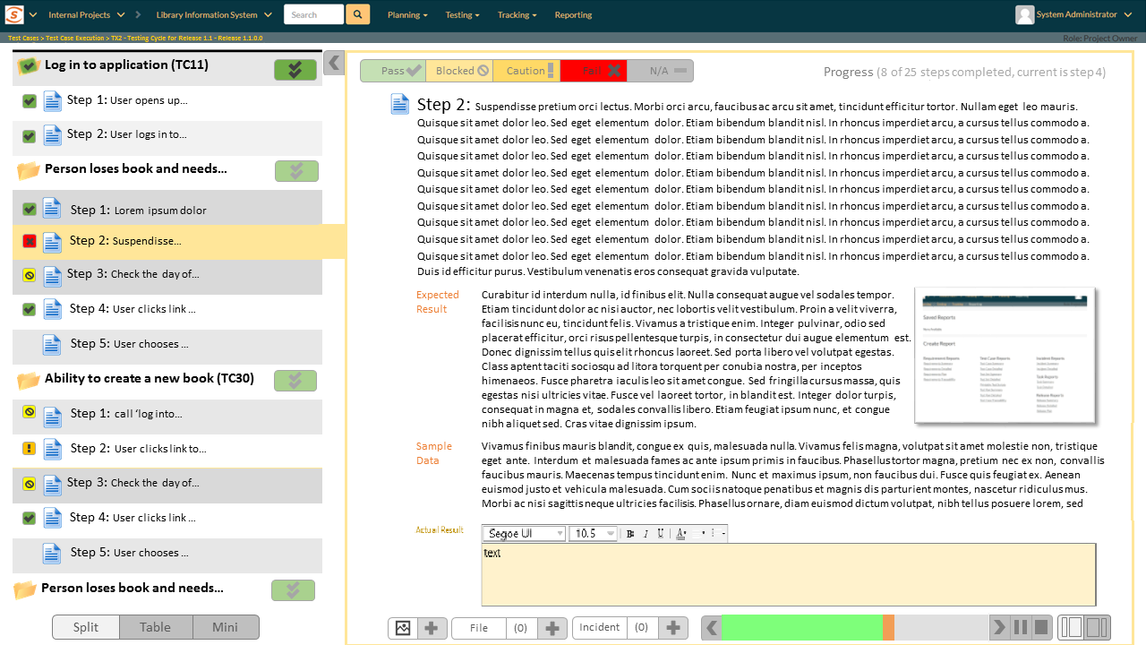
One Company's Perspective on Test Execution
We have a lot to think about from those who have shared ideas and suggestions on the draft designs we shared with you last week and the week before. One customer shared a detailed explanation with us about what further changes made sense for their business, including reworking our mockup of the split view. We are really grateful to them and their colleagues for the time they took to share this with us, and for letting us share it with all of you. Please let us know what you think.

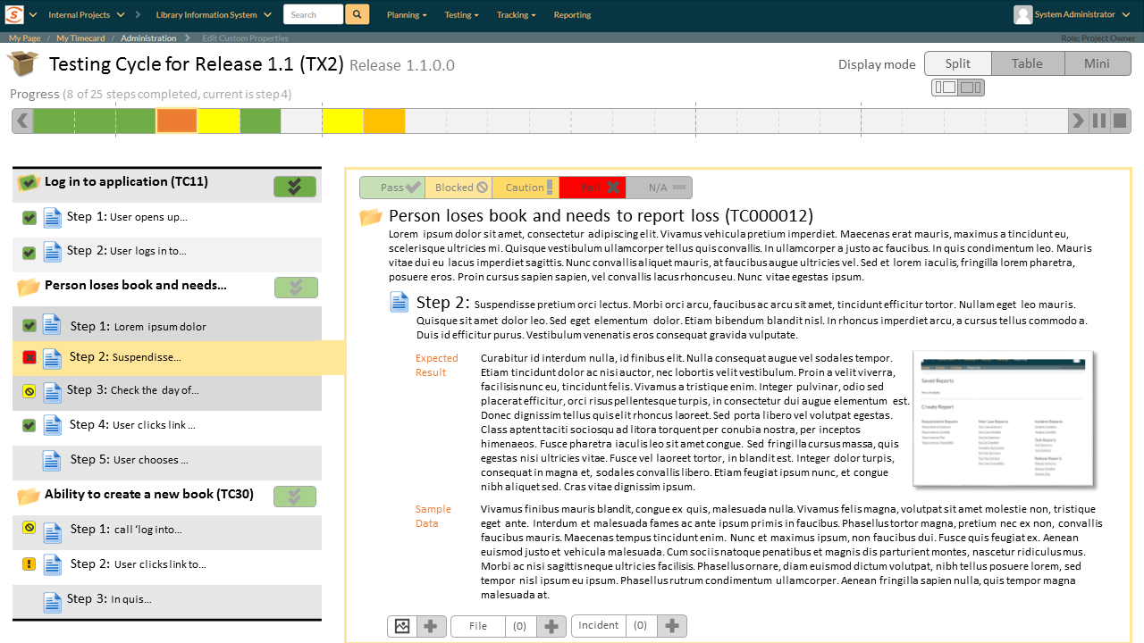
For comparison, here is the view this is based on from our in-house mockups:
With Appeal to Many More?
If you play 'spot the difference' you can find at least ten changes they have made to our own mockup of this view. Their central theme is to maximize the content on the screen--specifically of the current test step.
Context is still provided through the narrow table on the left (though with a new option to minimize it). Elements like the display mode buttons and the progress bar are reduced in prominence (downsized and moved to the bottom of the page).
In their view, the newly expanded (full-width) progress bar would not be useful when there are many test steps. We have been thinking about this-- perhaps the bar should show test steps if there aren't many, but test cases where the numbers are larger.
Another interesting point is the removal of the test case description in the detailed inspector view--they suggest that this only needs to be shown for the first step in each case, and after that it could be hidden.
What Do You Think?
We want the new test execution page to fit as neatly as possible with how our customer work. So we would love to hear what you think of this suggested restyle. Please drop us an email with your views.
In particular:
- Do you agree that you only need to see the test case description once (for the first step of that case), and after that it can be hidden?
- How useful do you think the progress bar will be to quickly seeing and navigating through your tests?
- For those of you who want to use the new split view, do you have a gut preference for either our in-house mockup of that from our customer?
