January 8th, 2016 by Adam Sandman
We have been working hard in 2015 to completely update the user interface of KronoDesk to make it fully mobile-responsive, optimize its user experience and also improve its performance. This is of course in addition to the new features already planned (ability to group accounts, reporting, ability to send documents, customizeable roles).
In the new version of KronoDesk we have used the power of jQuery, jQueryUI and Bootstrap to deliver a lightweight, fully-responsive user interface that comes with several pre-built themes and also uses the jQueryUI theme framework to allow you to easily customize the branding to match your company website / style.
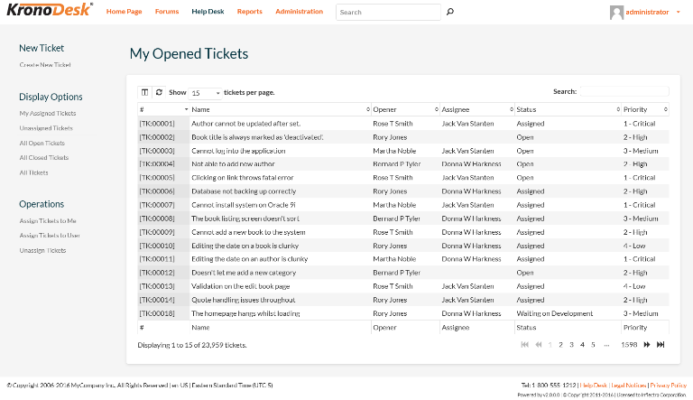
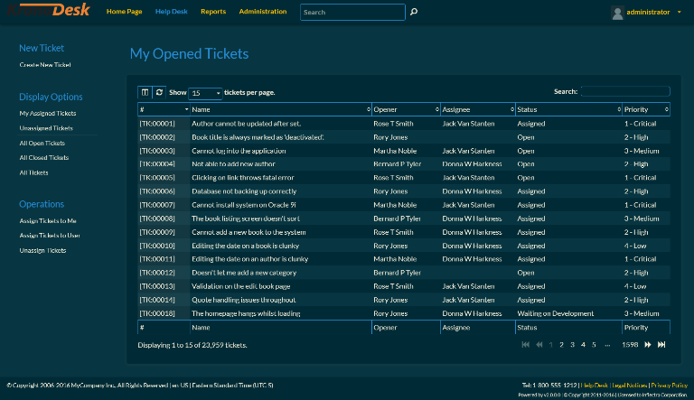
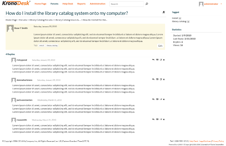
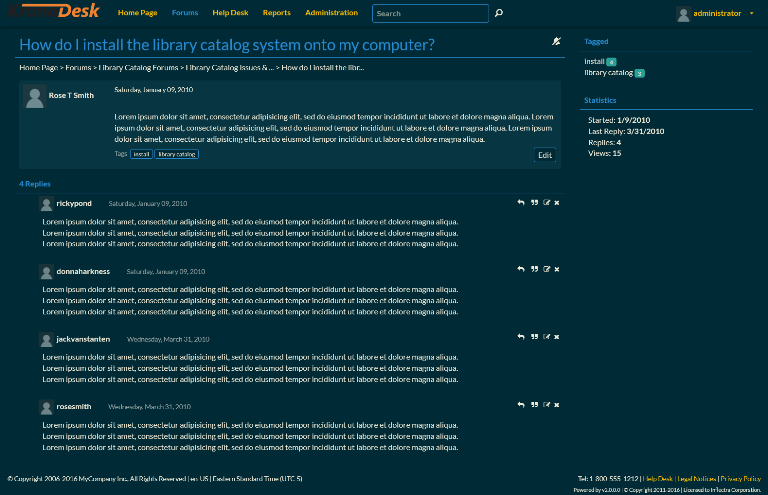
The following screenshots illustrate how the new version will look, with a sample dark and light theme:
Help Desk Ticketing
The heart of KronoDesk is the help desk ticketing system, with the new version we've streamlined the page, made the tickets the focus of the page, eliminated unnecessary scrolling and also added the ability to customize the view and perform faster sorting, searching and filtering:

In the sample dark theme it would look like this:

Support Forums
The support forums are a heavily used part of KronoDesk so we have adopted a more modern, lightweight styling, with less boxes and borders. Although the functionality in this section has not changed as much as in the help desk, the forums are now fully mobile-responsive and have faster load times.

In the sample dark theme it would look like this:

Please let us know if you have any suggestions or feedback on the new user interface and screens.