Optimized for All Devices
SpiraPlan has been designed to optimize its features on any device, whether that be a large desktop monitor, a tablet or mobile phone. The following sections outline some of the common scenarios for different types of device:
The Desktop Experience
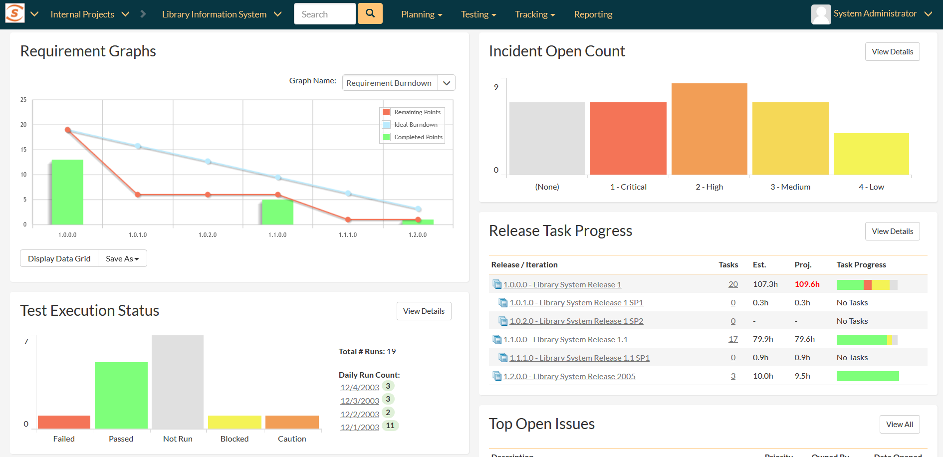
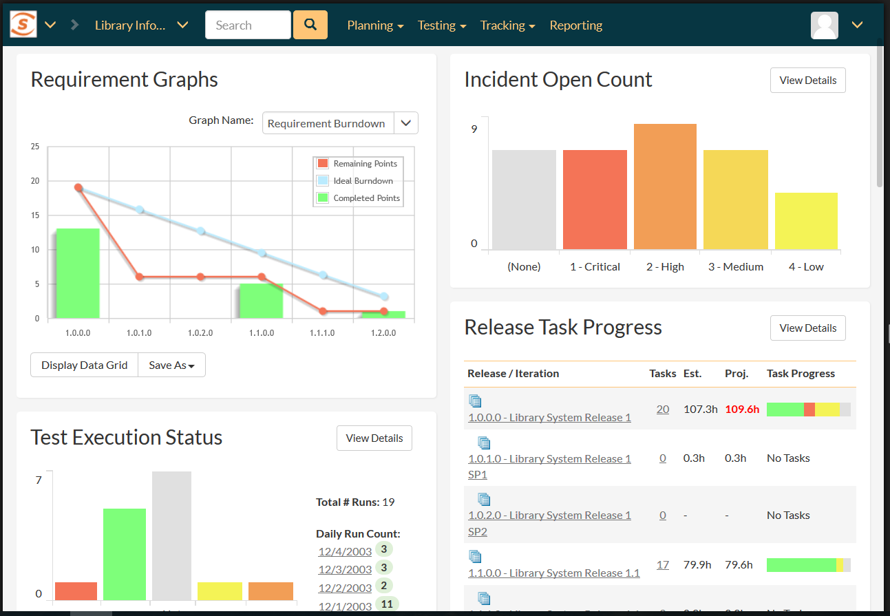
For full-size devices, SpiraPlan maximizes the available screen real estate to display dashboards summarizing the progress, quality and status of your projects:
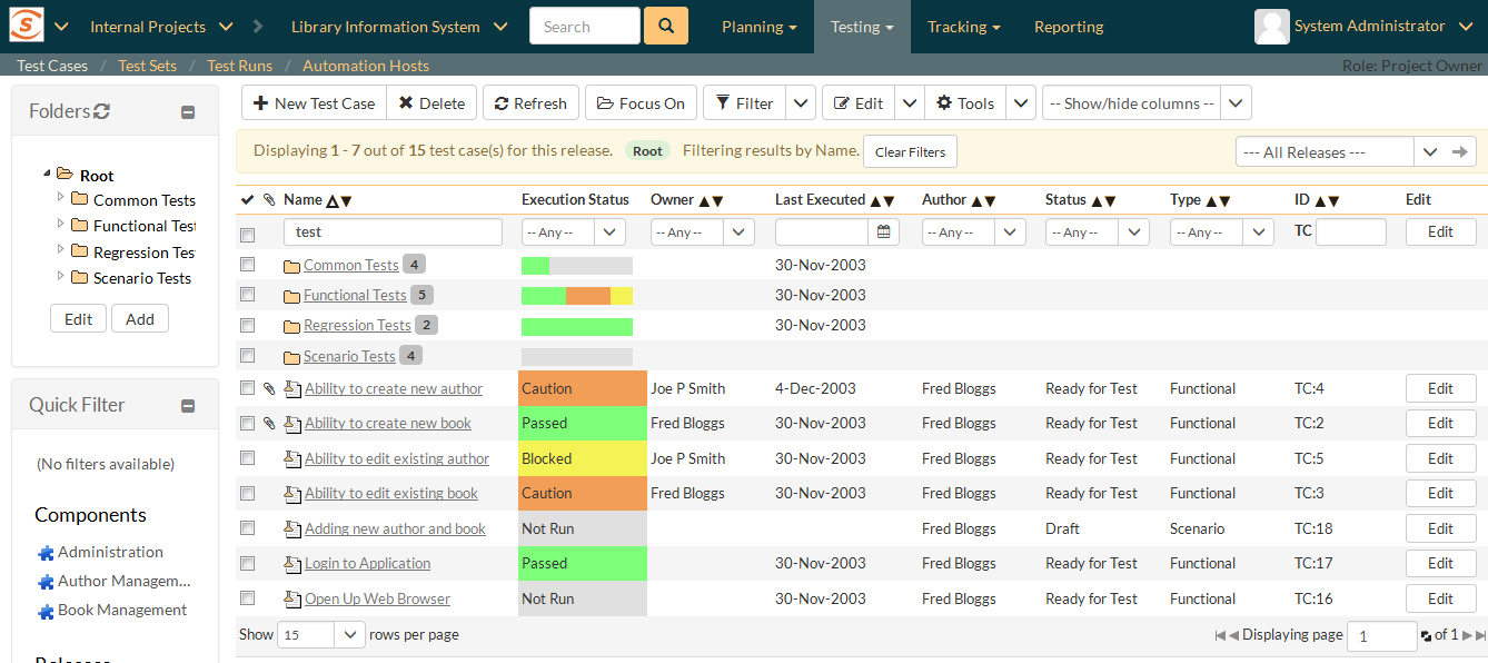
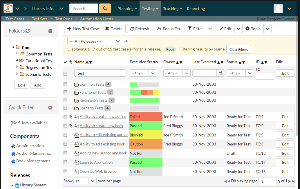
You can drill down on specific items to get the list of results that match your enquiry. For large screens you get access to all of the fields in a comprehensive view
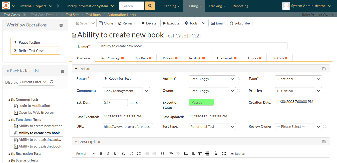
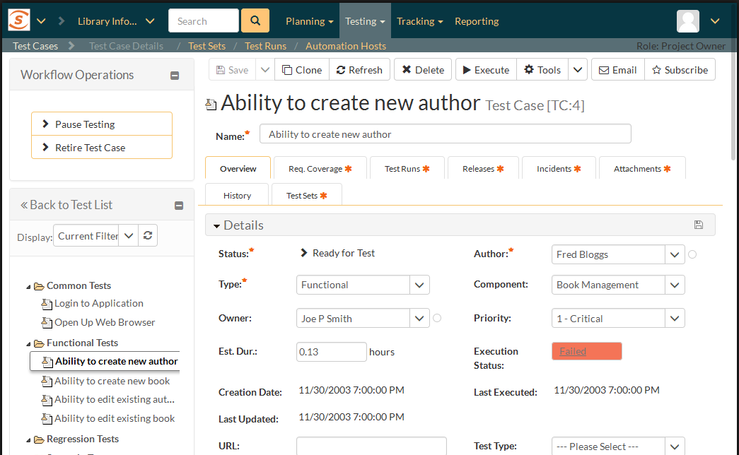
You can click on items that match the filter to display a full detailed view of the item together with all related information:
For large screen devices, SpiraPlan is able to maximize the available screen real estate with multiple columns of data organized with effective use of white space for maximum clarity.
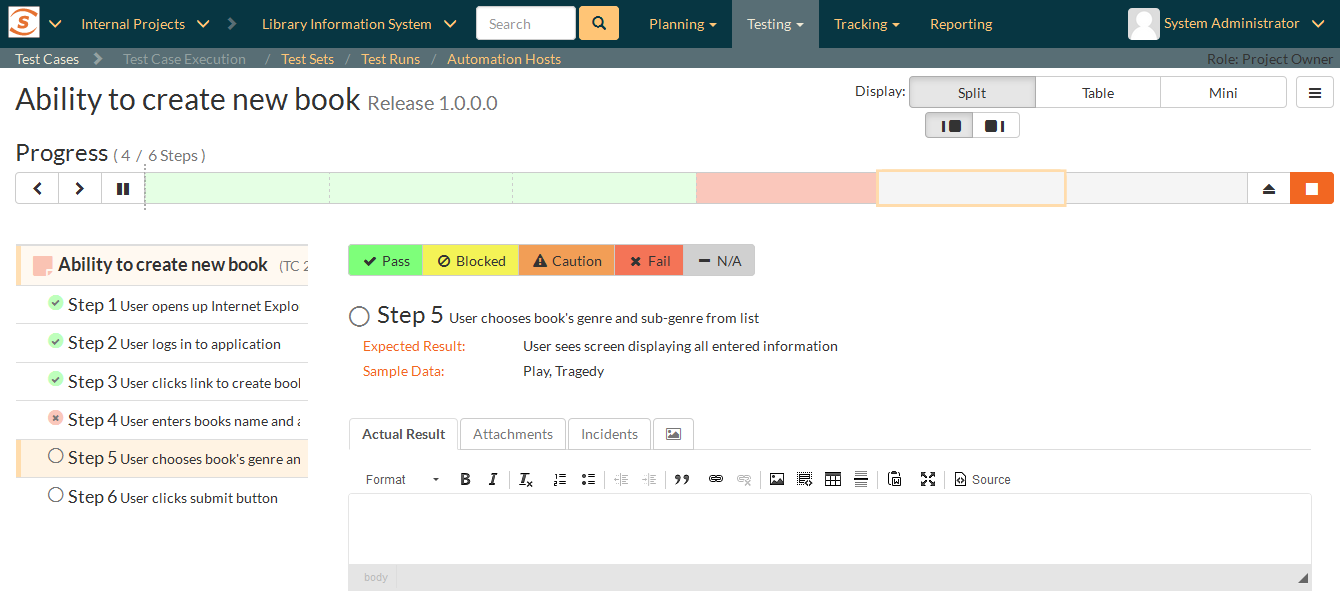
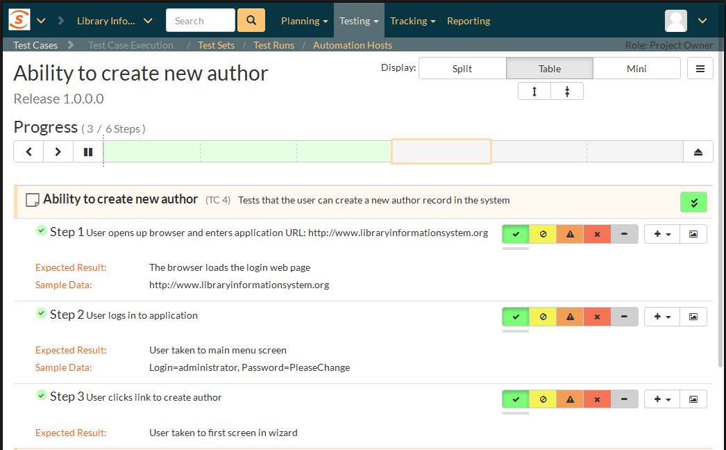
When you execute tests on a full screen device, you have a choice of display modes (list, split, mini) that allow you focus on the most important information for your types of testing activities:
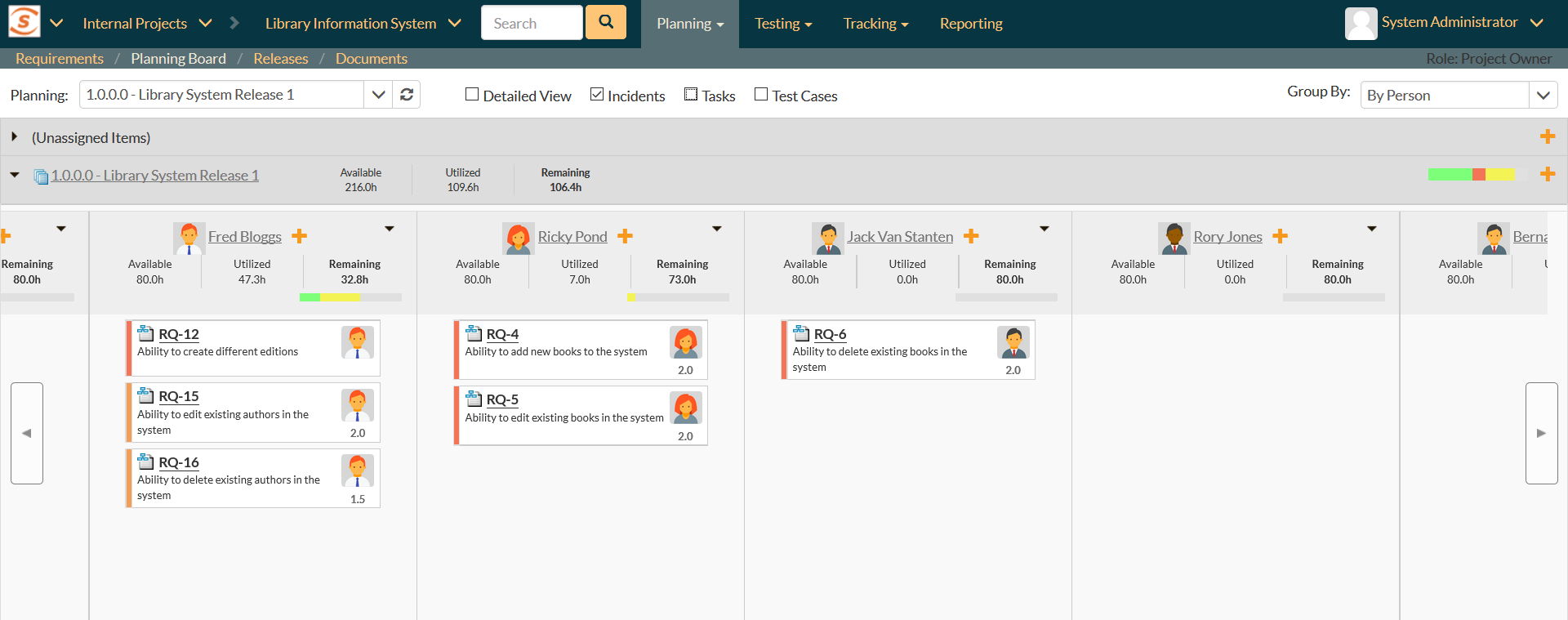
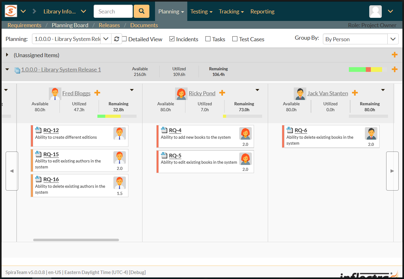
The agile Planning Boards built into SpiraPlan allow you to see the complete project on large screen devices, with the ability to easily drag and drop items between releases, iterations, statuses and team members using either touch or mouse.
The Tablet Experience
For mid-sized devices such as a tablet, lightweight laptop or similar hybrid device, SpiraPlan automatically adjusts to show you the most relevant information in the dashboards and reports.
SpiraPlan is designed to handle mouse events and touch gestures, so regardless of whether you click, tap, swipe or drag, SpiraPlan is able to assist. When you drill down on items, SpiraPlan shows you the same list view as on larger screens, but with the fields and options optimized for your device:
When you click on a specific item, SpiraPlan gives you the full range of functionality for editing the item, approving it, viewing the history, attachments and other items.
For test execution, SpiraPlan provides you with the full choice of display modes (table, split) with the options tailored for the tablet size and orientation:
The agile Planning Boards are designed to be used equally well by either touch, mouse or keyboard. You can use all of the same views on a tablet as a full-sized device.
The Phone Experience
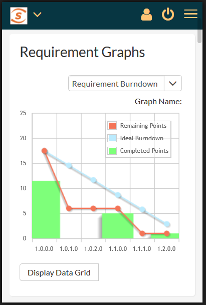
For the smallest, phone-sized devices, SpiraPlan cuts down the reports and dashboards into a form that can be quickly viewed in scrollable form on a mobile phone. You can keep on top of your projects whilst on the move:
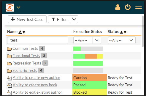
In addition to easy to scan graphs and charts, you can use SpiraPlan on a phone to browse lists of test cases, requirements, tasks, builds and defects that match your queries:
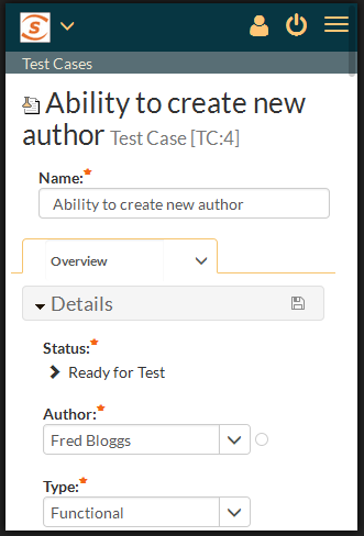
When you tap on an item you get a compact preview page that displays the most important information at your fingertips:
From within this mobile view you can make changes, assign test cases, test sets, requirements, tasks and defects, approve items and see the history and comments on each item.
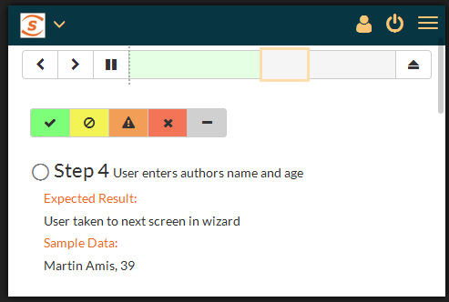
You can run tests from the convenience of your smartphone, using the specially-build ‘mini’ view:
During test execution, you can attach screenshots to failed tests using the device’s built-in camera, providing additional context.
Try SpiraPlan free for 30 days, no credit cards, no contracts
Start My Free TrialAnd if you have any questions, please email or call us at +1 (202) 558-6885
